What the heck is responsive design?
We love the blank look we get when we mention responsive web design. It’s similar to one we get when we say SEO. Unless you are a website design company or are in a like industry, no one understands what you are talking about.
Let’s take a moment to explain.
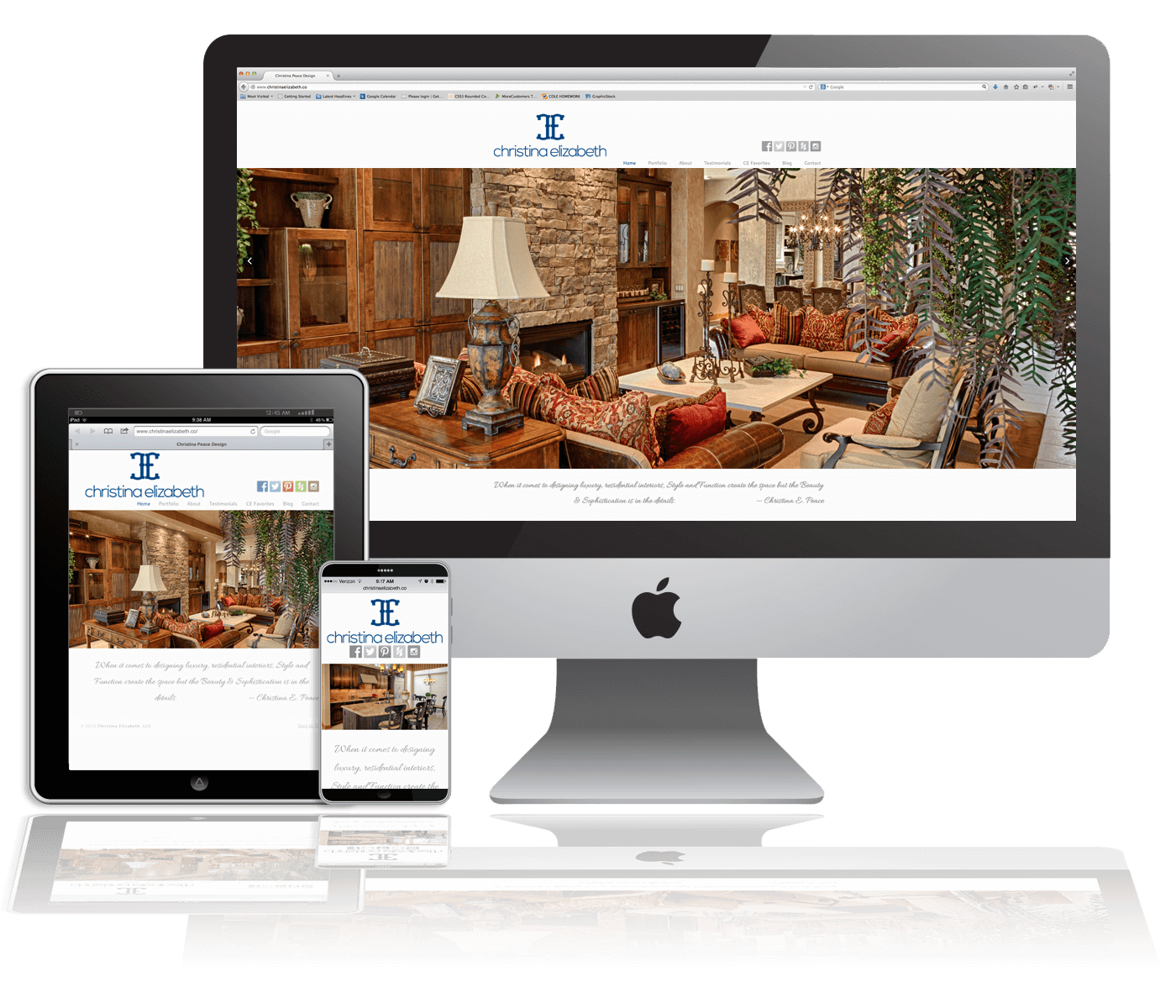
Simply put, responsive design is a website design that looks good across a wide range of electronic devices. This means your desktop, tablet, iphone and laptop. Mobile internet usage is clearly on the rise with no indication of slowing down anytime soon. This means that your website design should look equally appealing on your smart phone as it does on your computer monitor. When a user is viewing a website on a desktop computer, they are seeing the full view. A responsive design will take all the content and images of that full site and retract it to fit on a smaller screen. Clearly, a responsive design creates a better user experience when they can view your website across all their devices.
Are there any other benefits to responsive design? You bet.
1. Increased conversion rates
Let’s first discuss what a conversion rate is. Conversion rate can be defined as the ratio of consumers who take action beyond just viewing your website. The action is determined by the marketer and can be something like calling the company, filling out the contact us form etc. Global Web Index reports that 80% of internet users do searches on their smart phone. If a consumer is shopping on their mobile device and they are unable to properly view a website, he or she is unlikely to convert. Will they switch to their desktop in order to get the information they were looking for on their mobile device? Maybe. Maybe not. We are a highly impatient society and we want immediate gratification. Why take the risk of losing a sale?
Responsive design will also allow marketers to do heatmapping which will help analyze their website traffic. Knowledge is power after all. The ability to review data will allow businesses to adjust their marketing efforts to increase their conversion rates.
2. Efficiency
Gone are the days where you have to create a separate mobile site. Two separate sites means double the maintenance and two separate SEO campaigns. Are you adding up the cost implications in your head? A desktop website and a separate mobile site are just not cost effective now that there is a better option.
3. Google recommends it
Google recommends responsive web design as a best practice for websites. Enough said. We all know that Google holds the market share when it comes to search engines so if they recommend something, we ought to listen. In April, Google started using mobile-friendliness as a ranking signal in search results. This modification to Google’s algorithm is anticipated to have a major impact on search results. The changes Google is making to its search results are intended to make a better search experience for mobile users. The bottom line is…failure to have a responsive design may negatively impact your SEO efforts.
If you would like to see if your site is mobile-friendly, Google has a tool to test your URL. If Google gives you the thumbs down, you know where to find us www.gettingraphic.net